
Project Summary
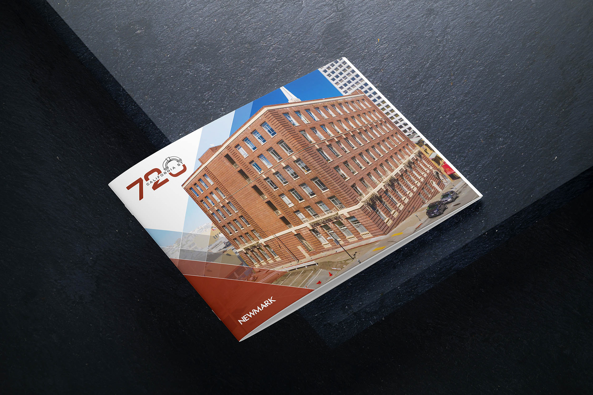
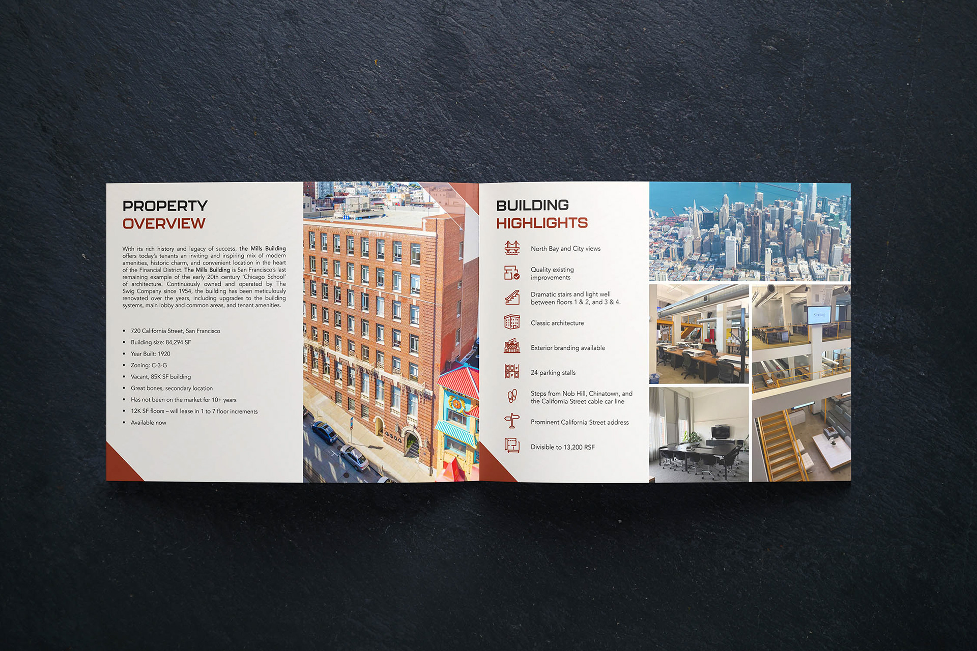
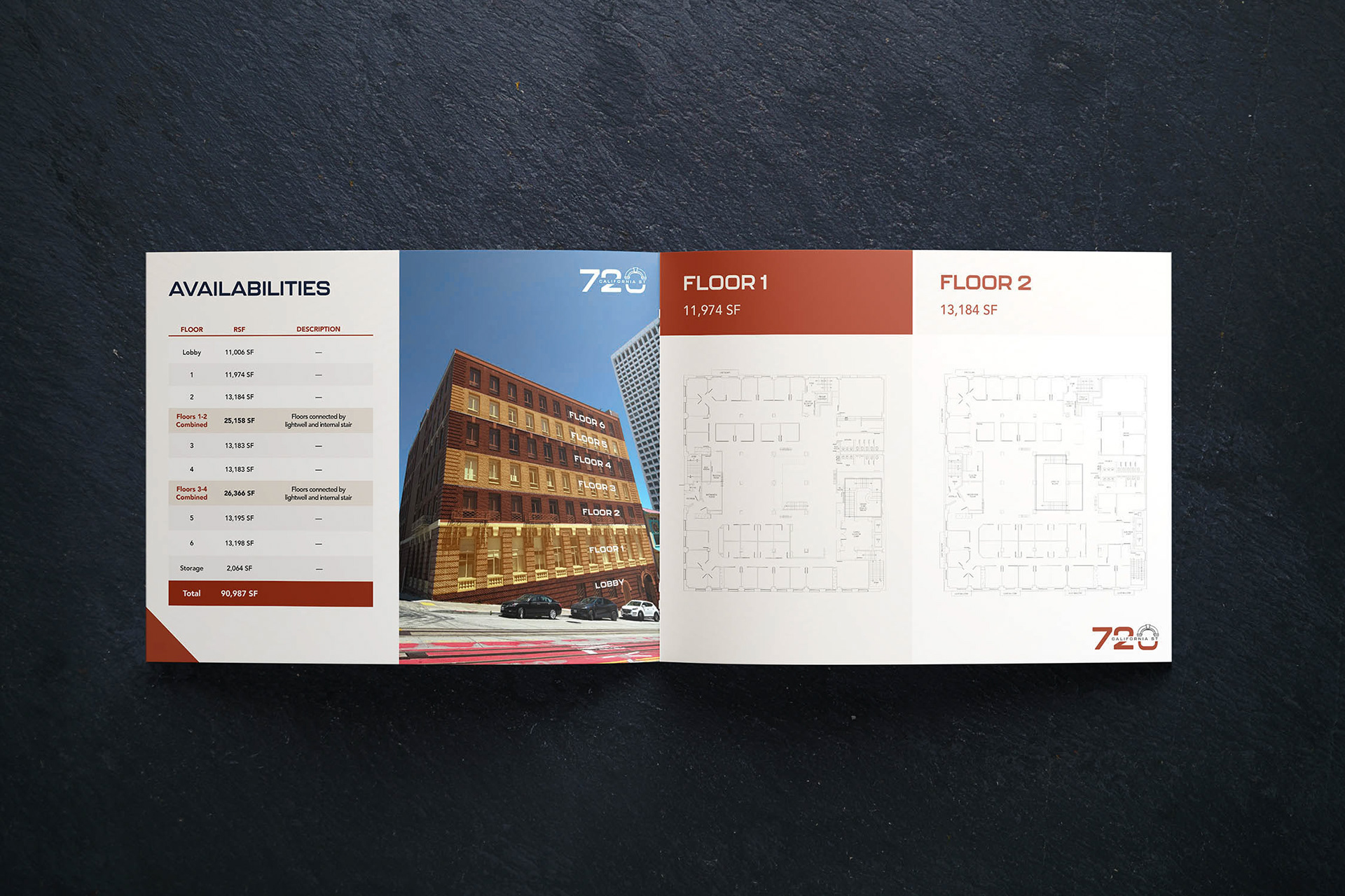
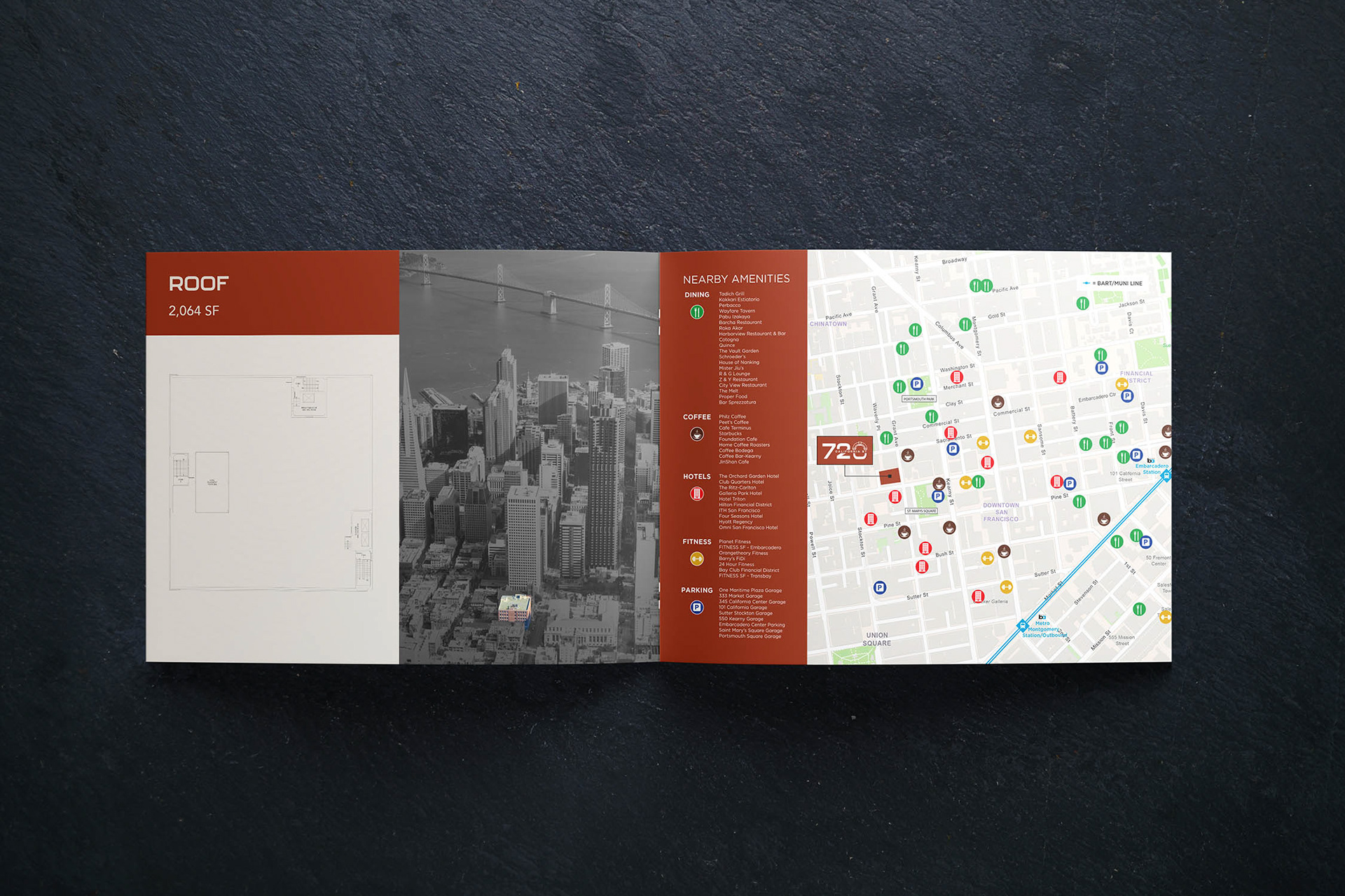
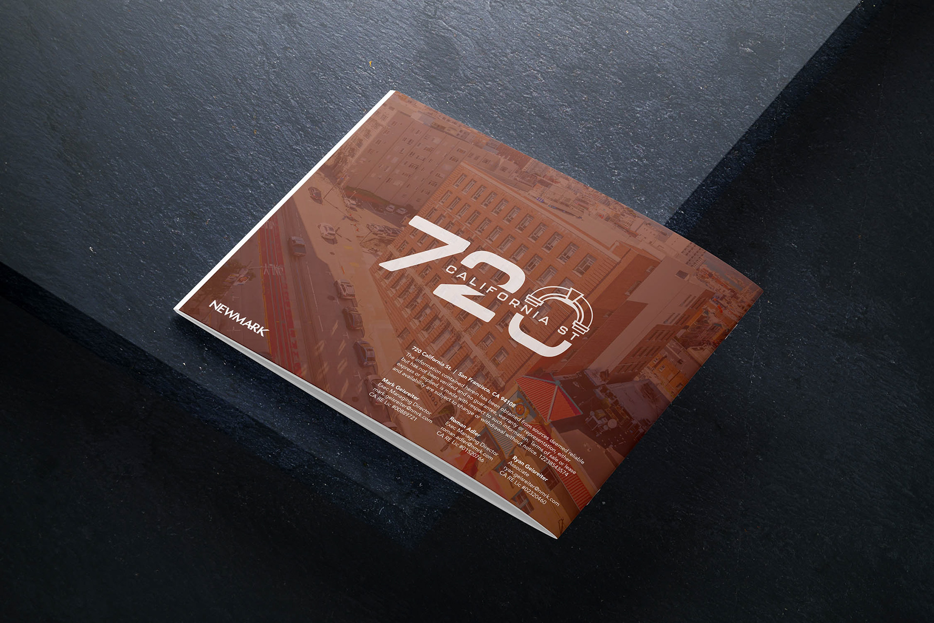
Created a refreshed marketing brochure for a commercial property being brought back to market. The goal was to give the building a modern, high end presentation that would help brokers attract prospective tenants and clearly communicate the value of the available space.
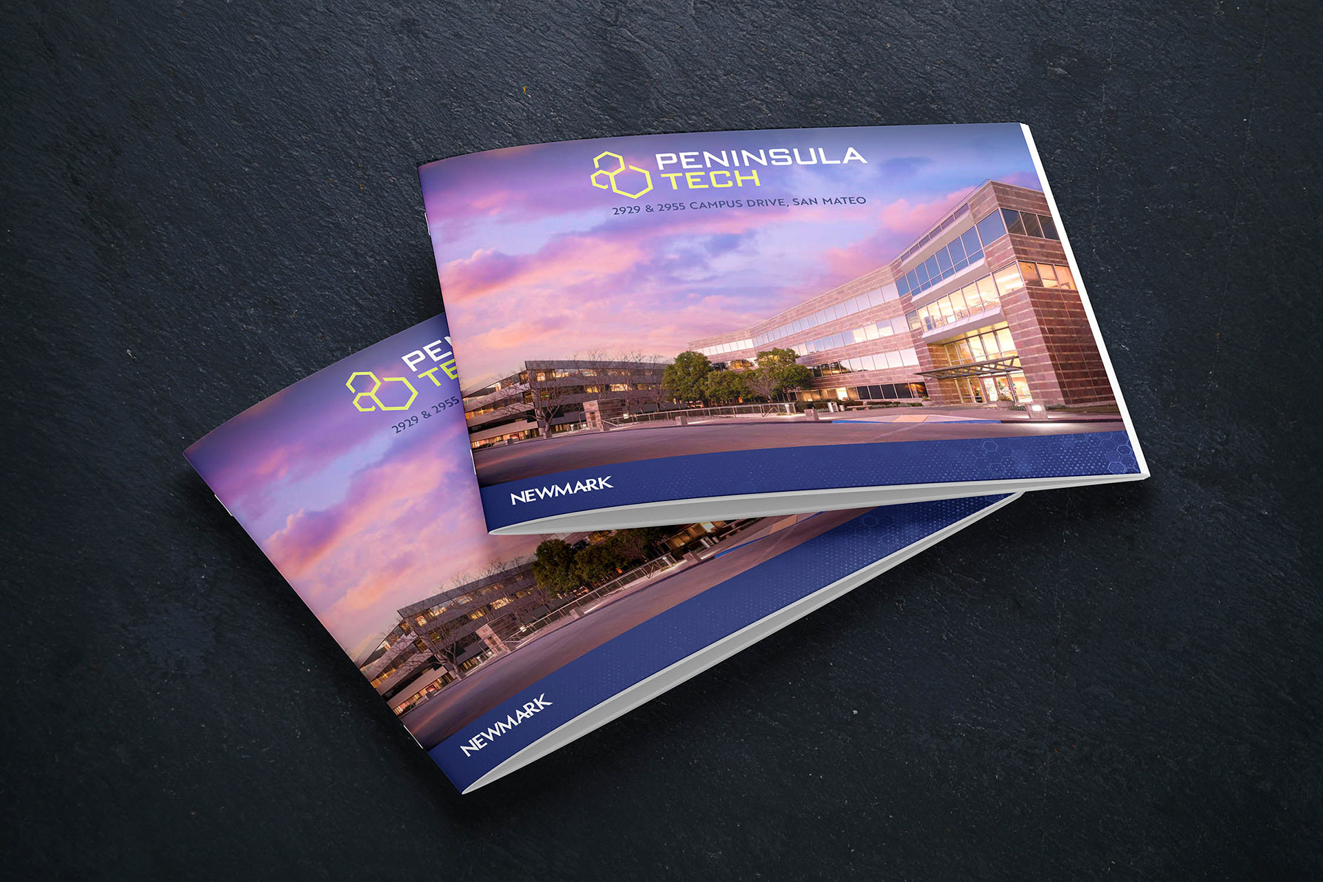
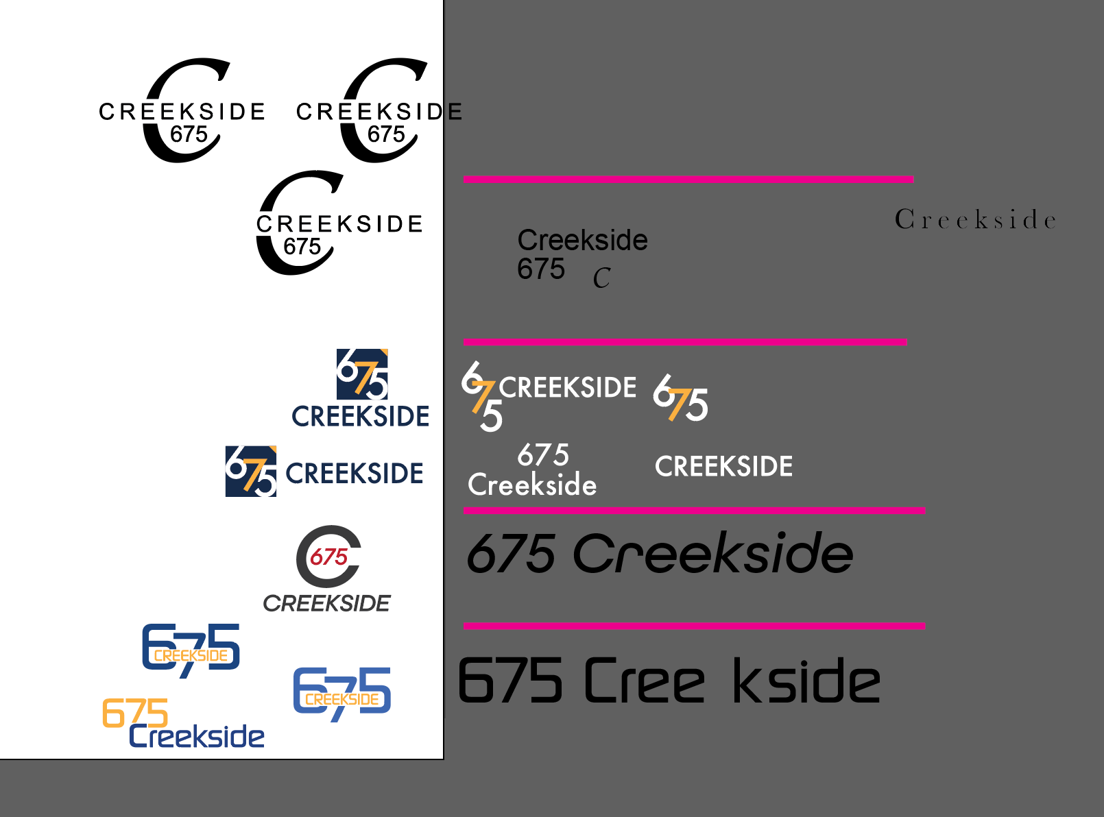
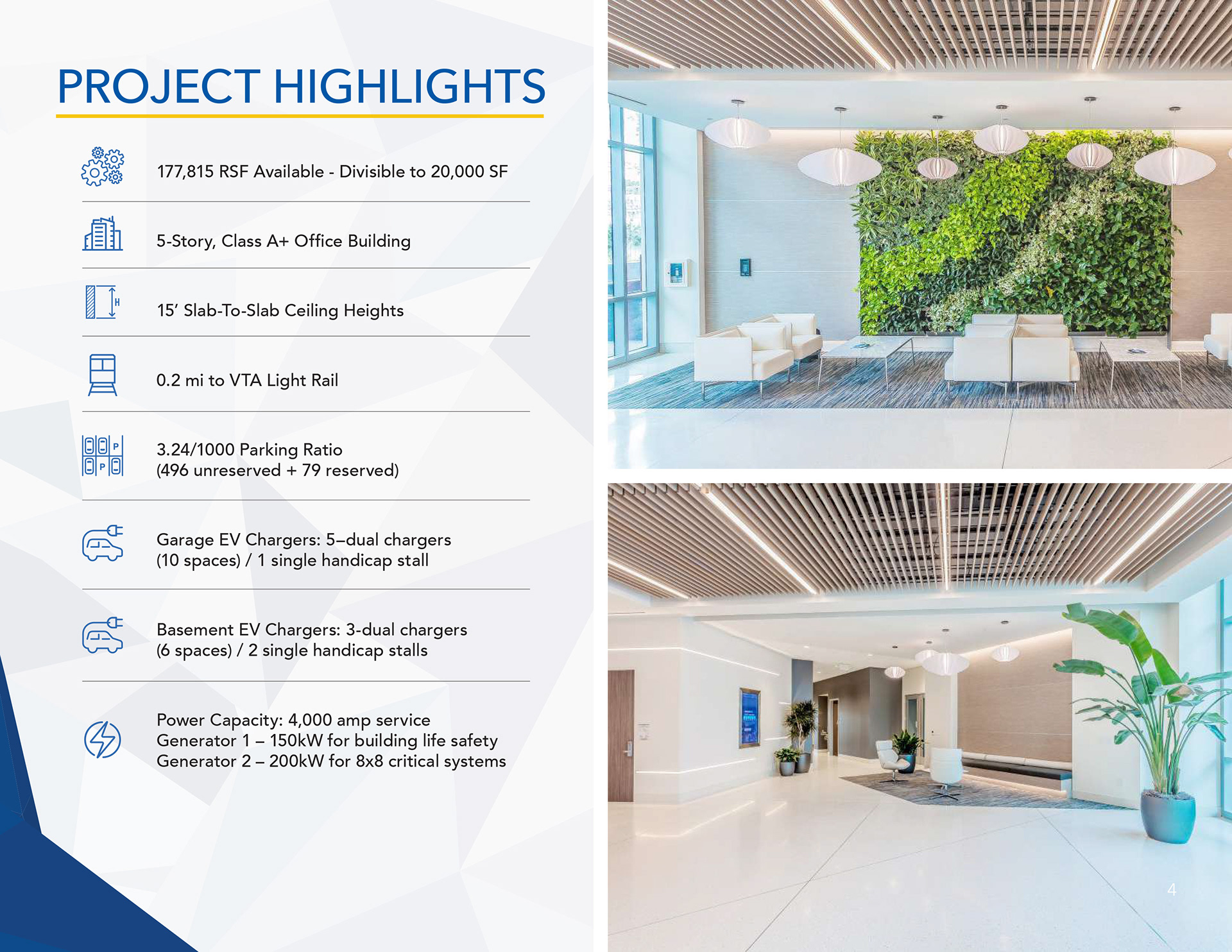
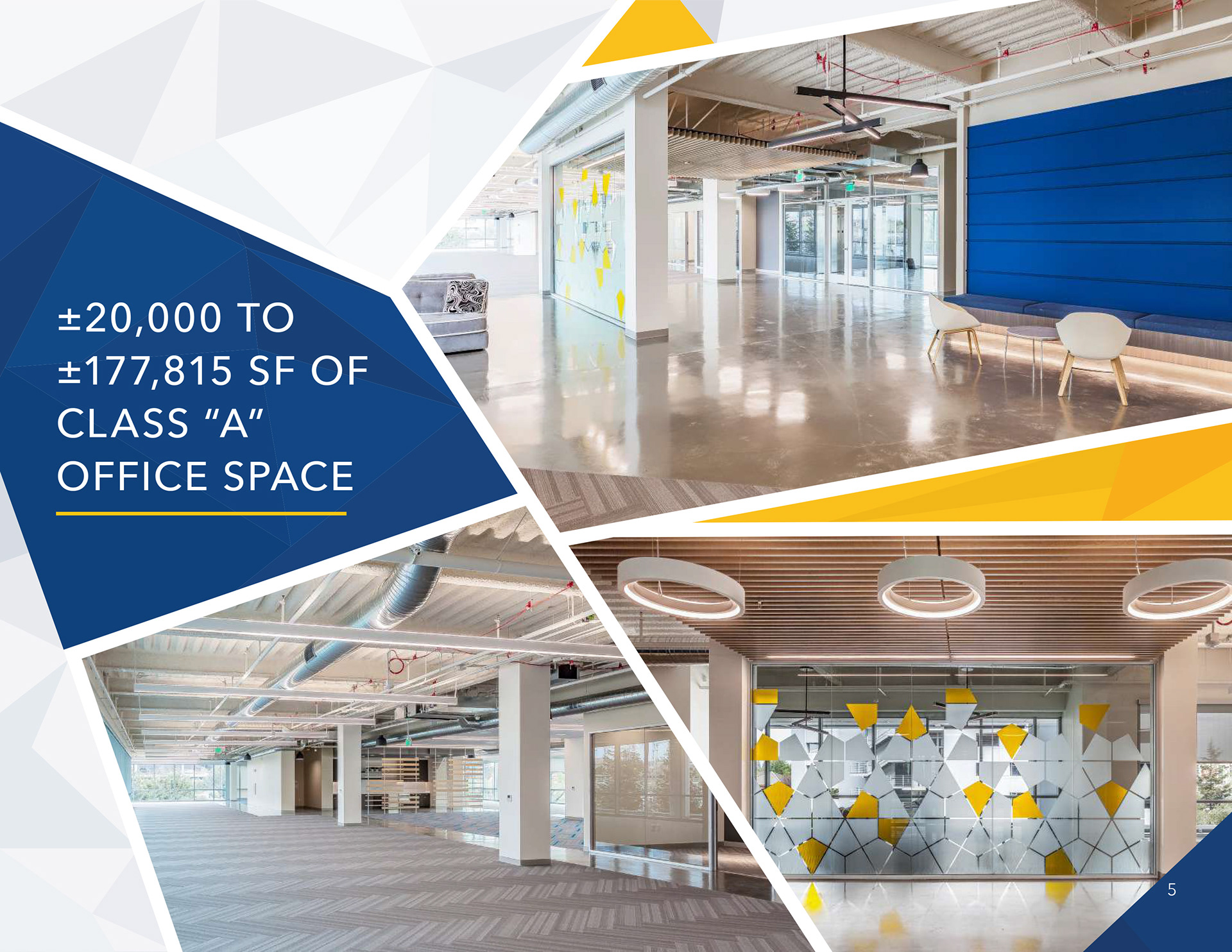
Because no photographer was available, I photographed a new exterior image for the cover and incorporated existing interior photography from the property’s previous marketing campaign. I also developed three custom logo concepts and established a refreshed visual direction to give the property a more current and distinctive identity.
Skills used:
Branding
Presentation Design
Layout
Logo Design
Color Grading
Photography
Print
Branding
Presentation Design
Layout
Logo Design
Color Grading
Photography
Challenges
The brochure had to be completed within a very short timeline while the design team was managing a high volume of property marketing requests. With many companies downsizing or vacating office space due to changing workplace needs, brokers were eager to bring available properties to market as quickly as possible.
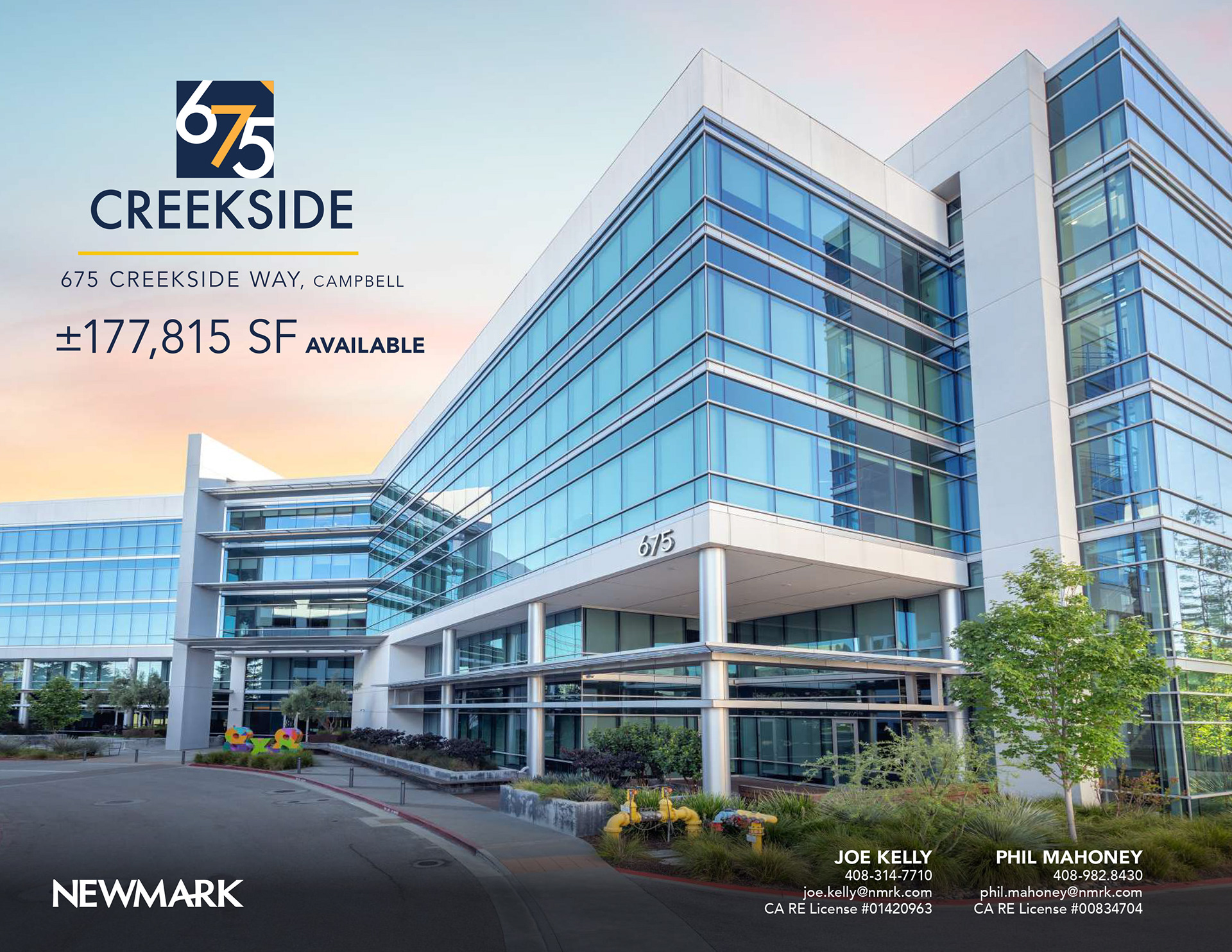
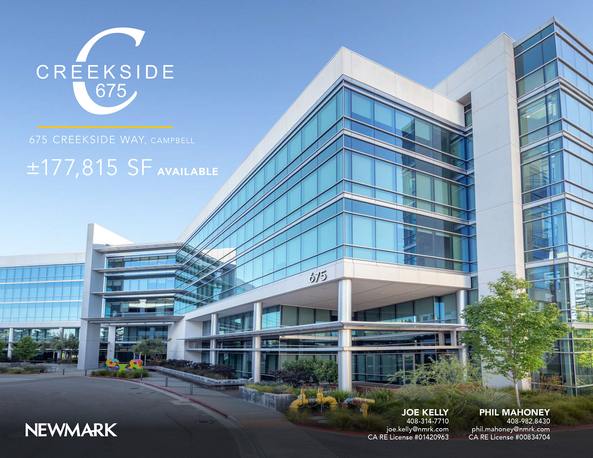
Photography was not originally part of my assignment, but I felt the existing exterior imagery was not strong enough for the cover. Because the cover image plays an important role in shaping a prospective tenant’s first impression, I took on the additional responsibility of photographing the property myself.
As the sole designer on the project, I also developed three logo concepts, established the property’s visual identity, and designed the full brochure from cover to completion all within the limited turnaround.
Solution:
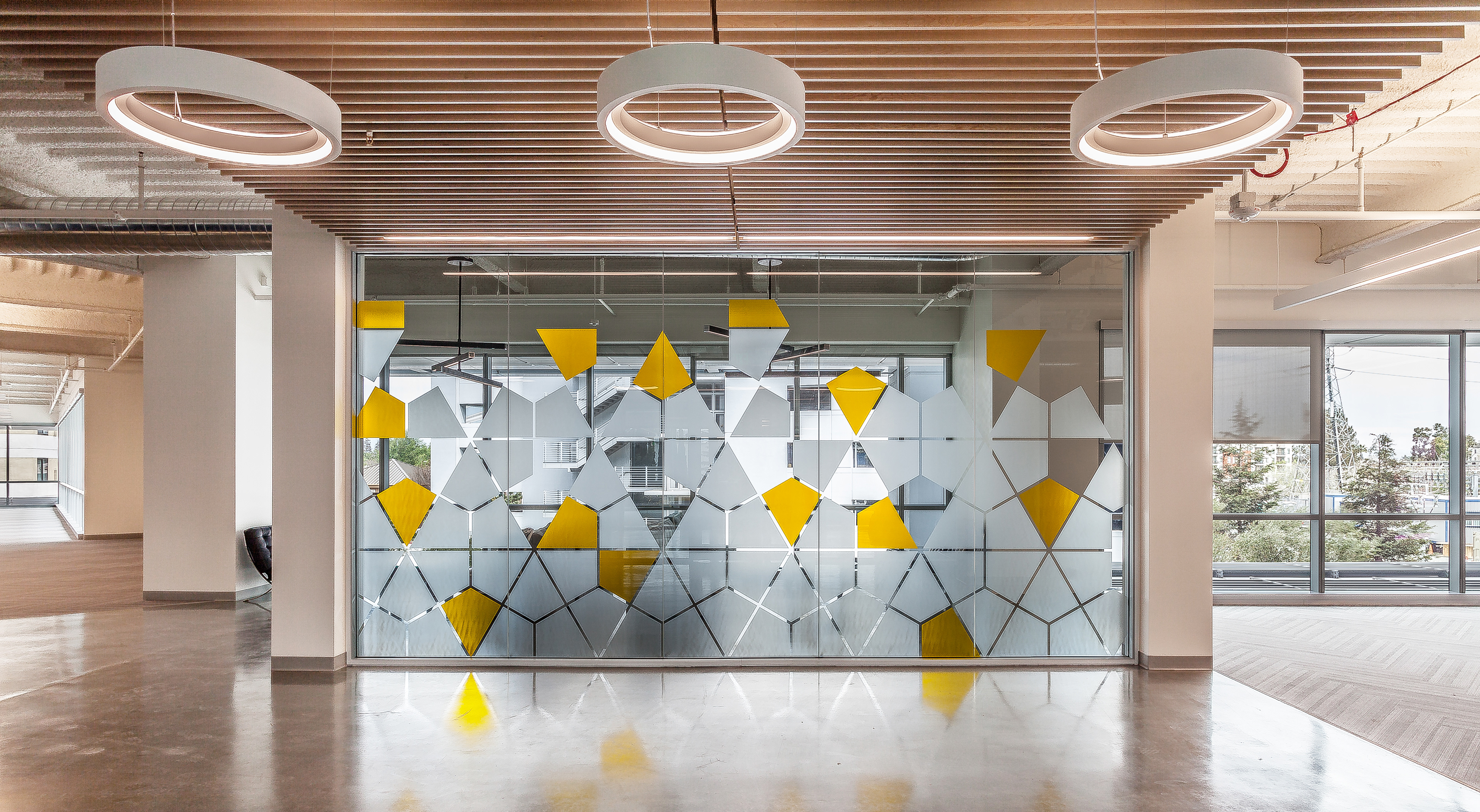
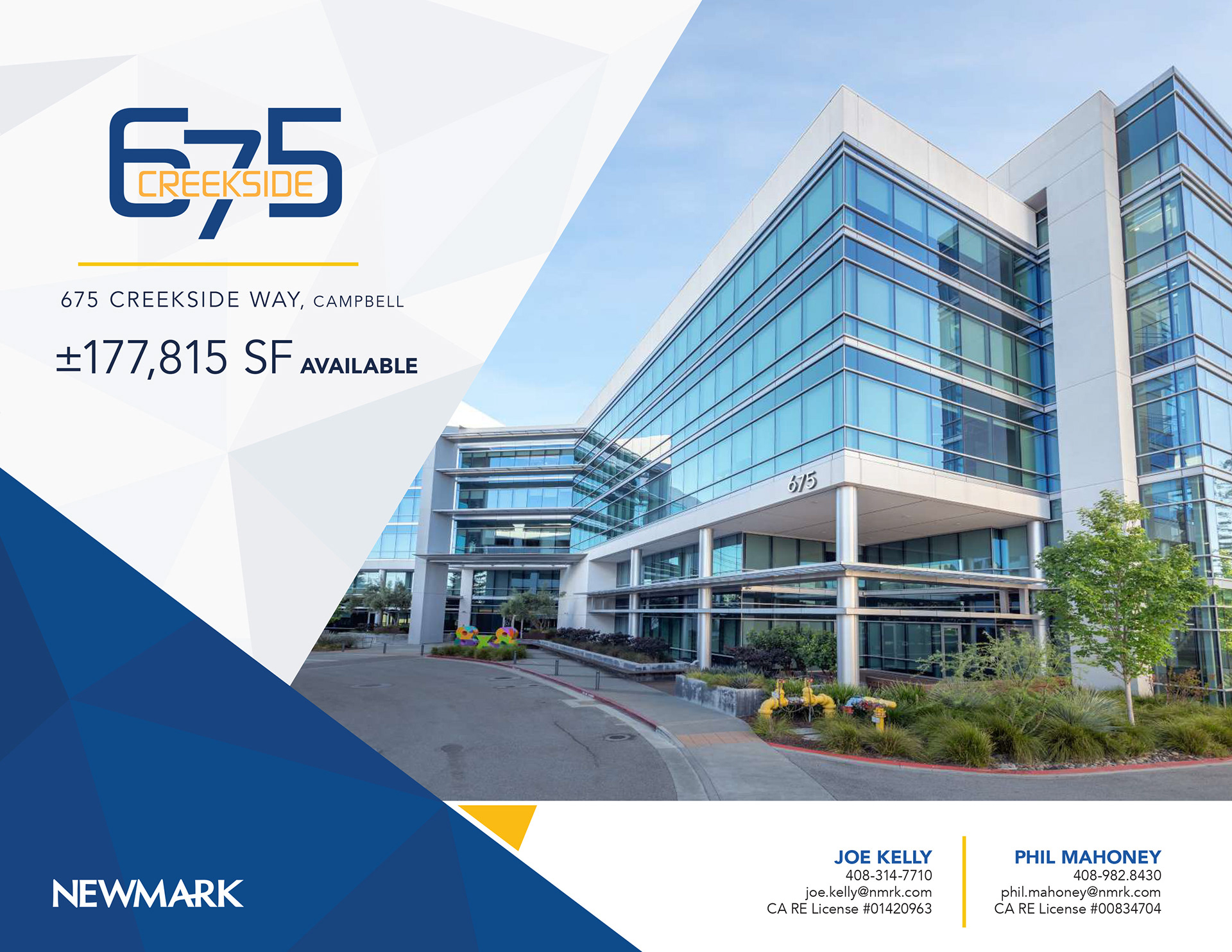
I used a triangular pattern found on an interior glass wall as inspiration for the brochure’s color palette, graphic elements, and overall visual system. This connected the refreshed identity directly to the property’s architecture and gave the marketing materials a distinctive, cohesive look.
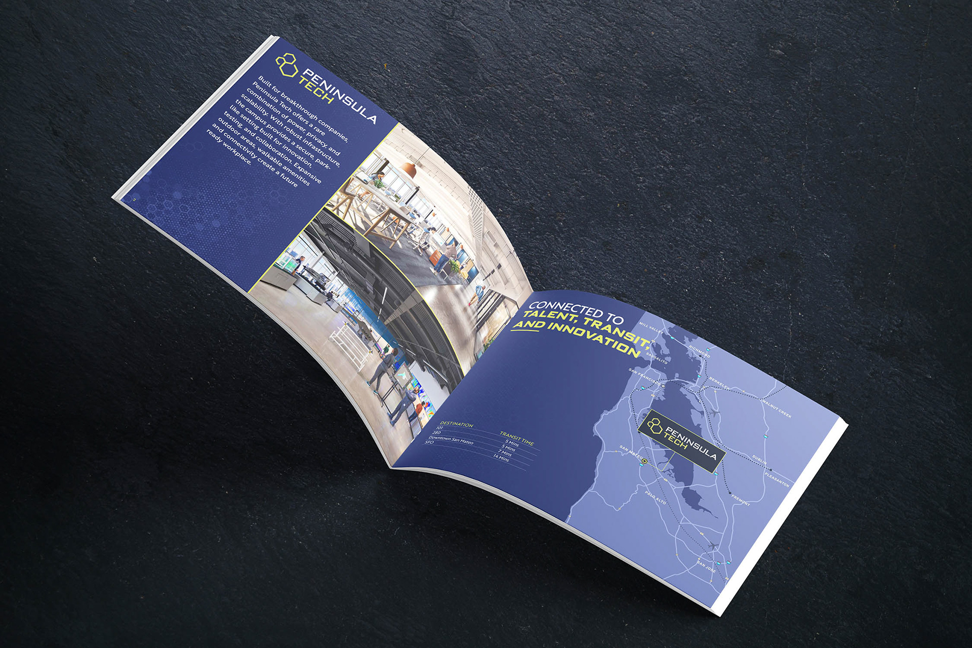
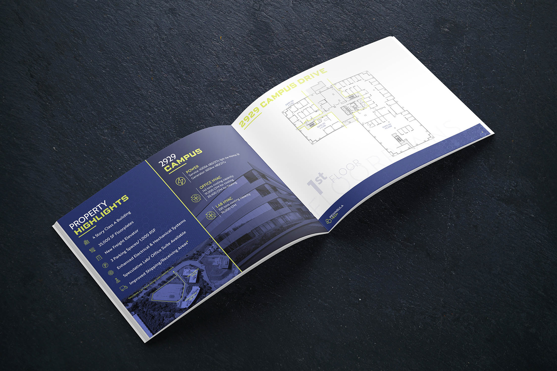
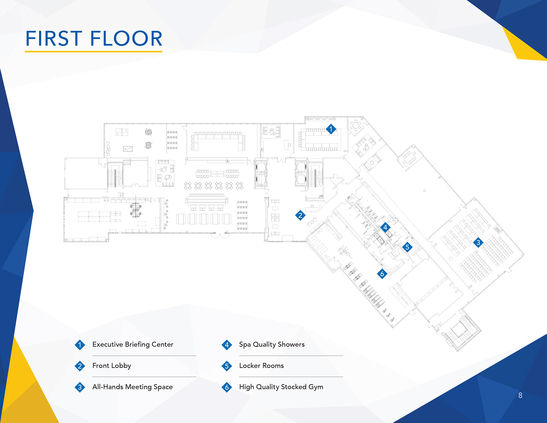
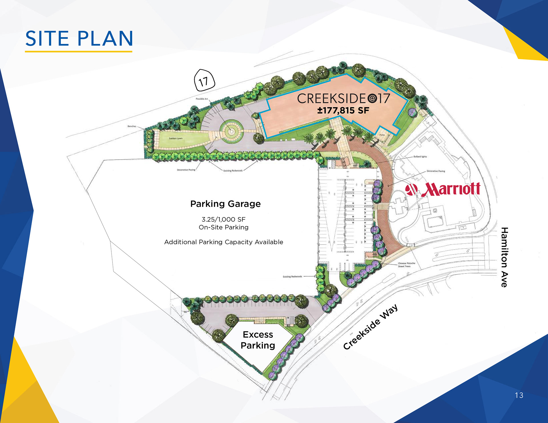
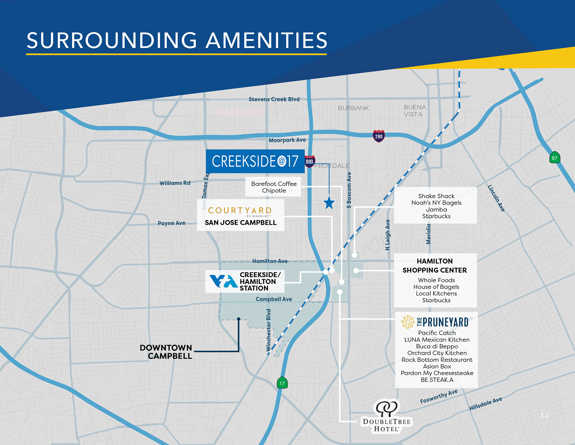
I organized floor plans, maps, photography, property highlights, and leasing information into a clear visual hierarchy so prospective tenants could quickly understand the building and available space. I also retouched the exterior cover image by correcting perspective distortion, removing distractions, and enhancing the building number while keeping the final result realistic.
To give the team flexibility, I developed multiple cover directions featuring different sky treatments, layout styles, and each of the three logo concepts.
Additional Work
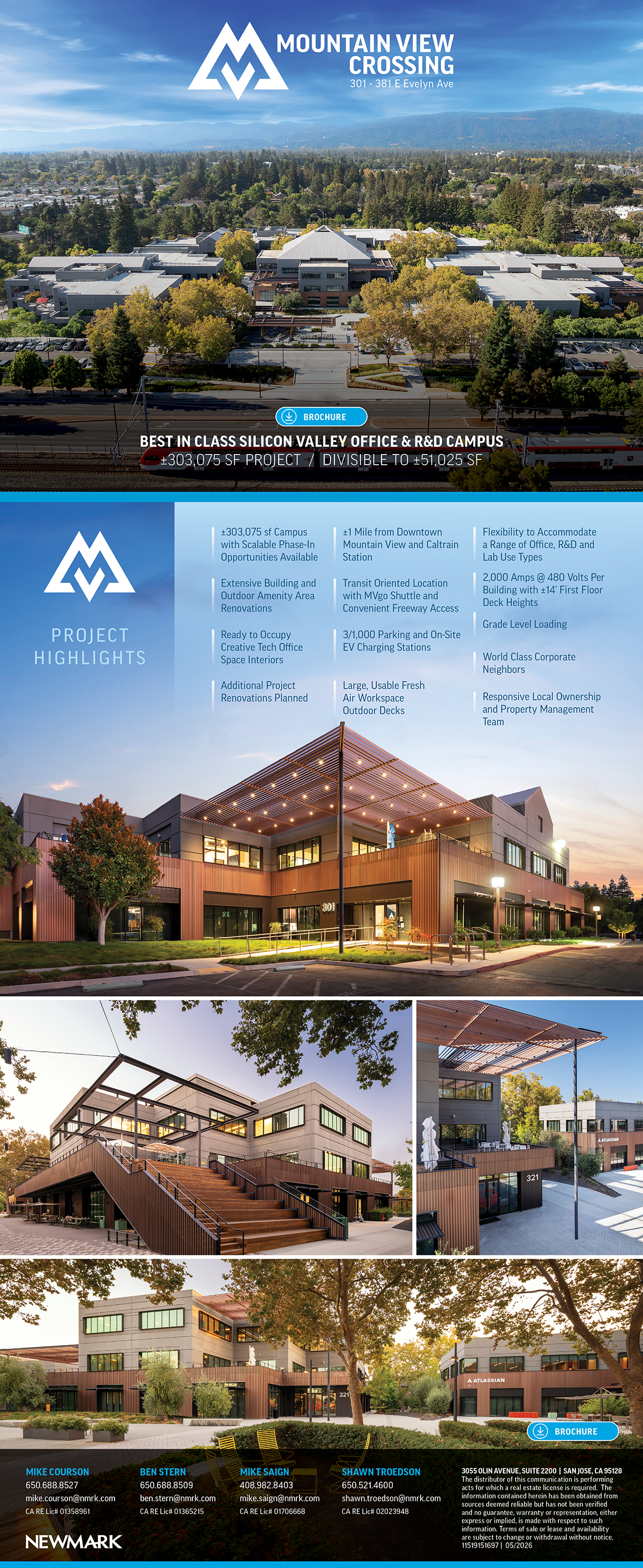
These additional examples show how each property’s marketing direction was tailored to its architecture, history, and intended audience. Rather than applying the same style to every brochure, I developed distinct visual approaches based on how the property needed to be positioned. For example, a building suited to technology companies might receive a more modern, tech-forward design, while a historic property may call for a more refined and timeless direction.
I also included an email campaign example to show how the property branding extended beyond the brochure into digital marketing used to promote available spaces to prospective tenants.