
Project Summary
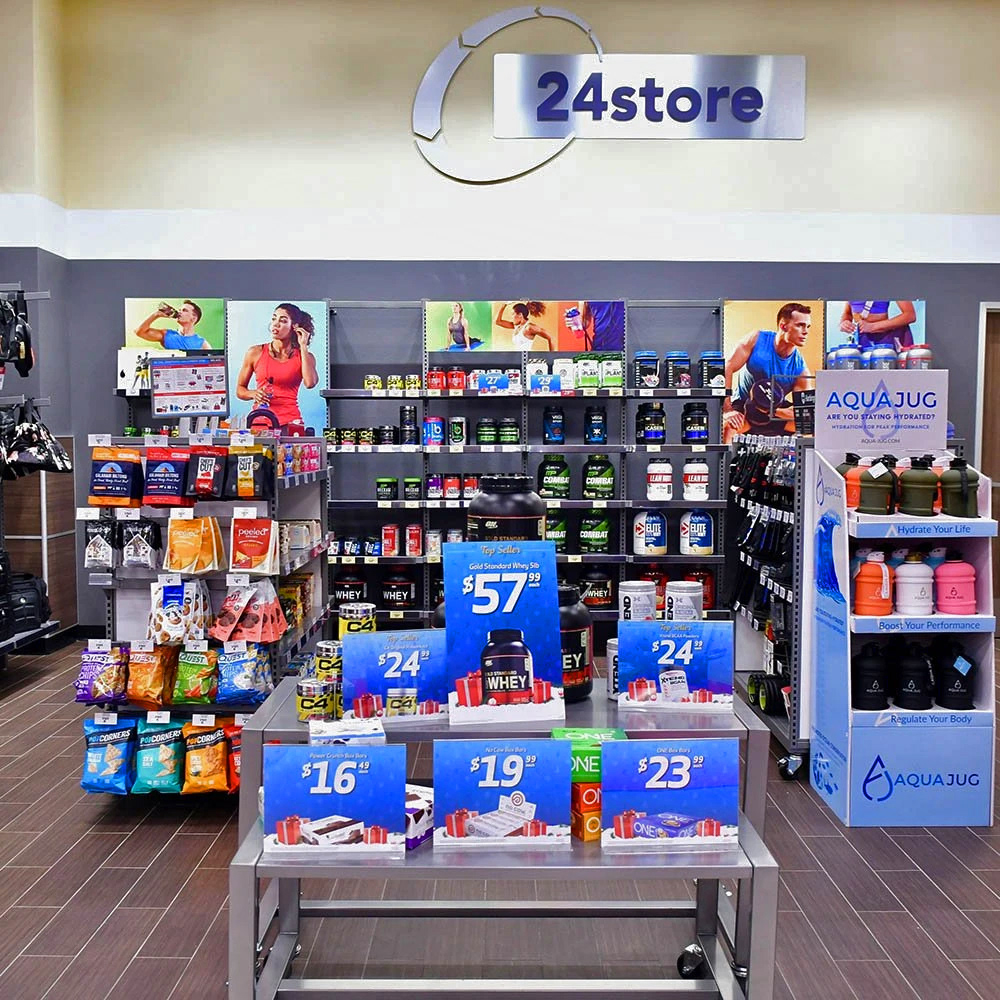
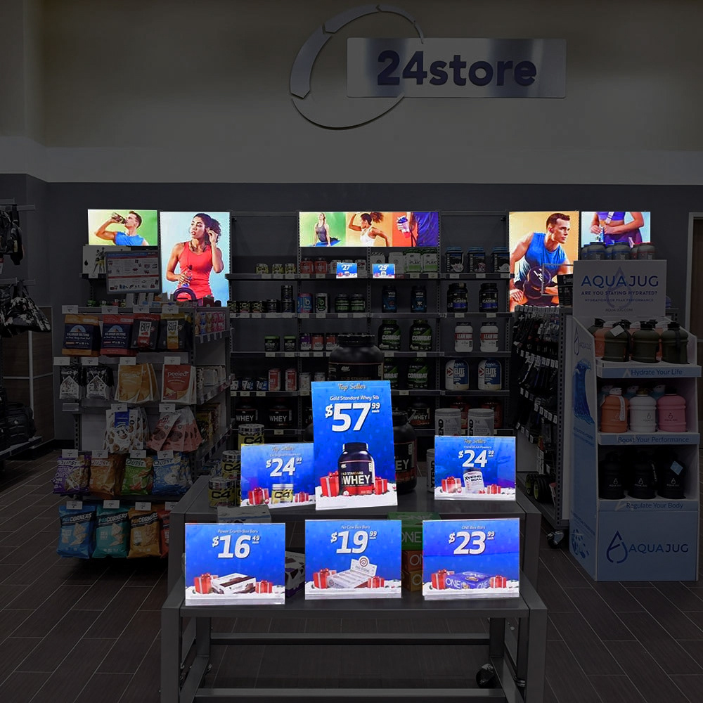
Our retail space had previously relied on generic stock images of athletes, often tied to holidays or seasons, resulting in a lack of cohesion and visual impact. To elevate the space, we decided to conduct a photoshoot with simple, vibrant background colors that would create a strong visual presence. This approach not only replaced the stock images with more dynamic, original content but also brought a unique, cohesive feel to the retail area. The goal was to extend this fresh, distinctive aesthetic to the creative offers throughout the space, ensuring a consistent and engaging experience for customers.
Skills used:
Photography
Brand Design
Icon Design
Compositing
Color Grading
High End Retouching
Photography
Brand Design
Icon Design
Compositing
Color Grading
High End Retouching
Problem
The retail creative lacked consistency and didn't align with the established 24 Store brand identity. Each month brought a different look, making it hard to create a cohesive experience.
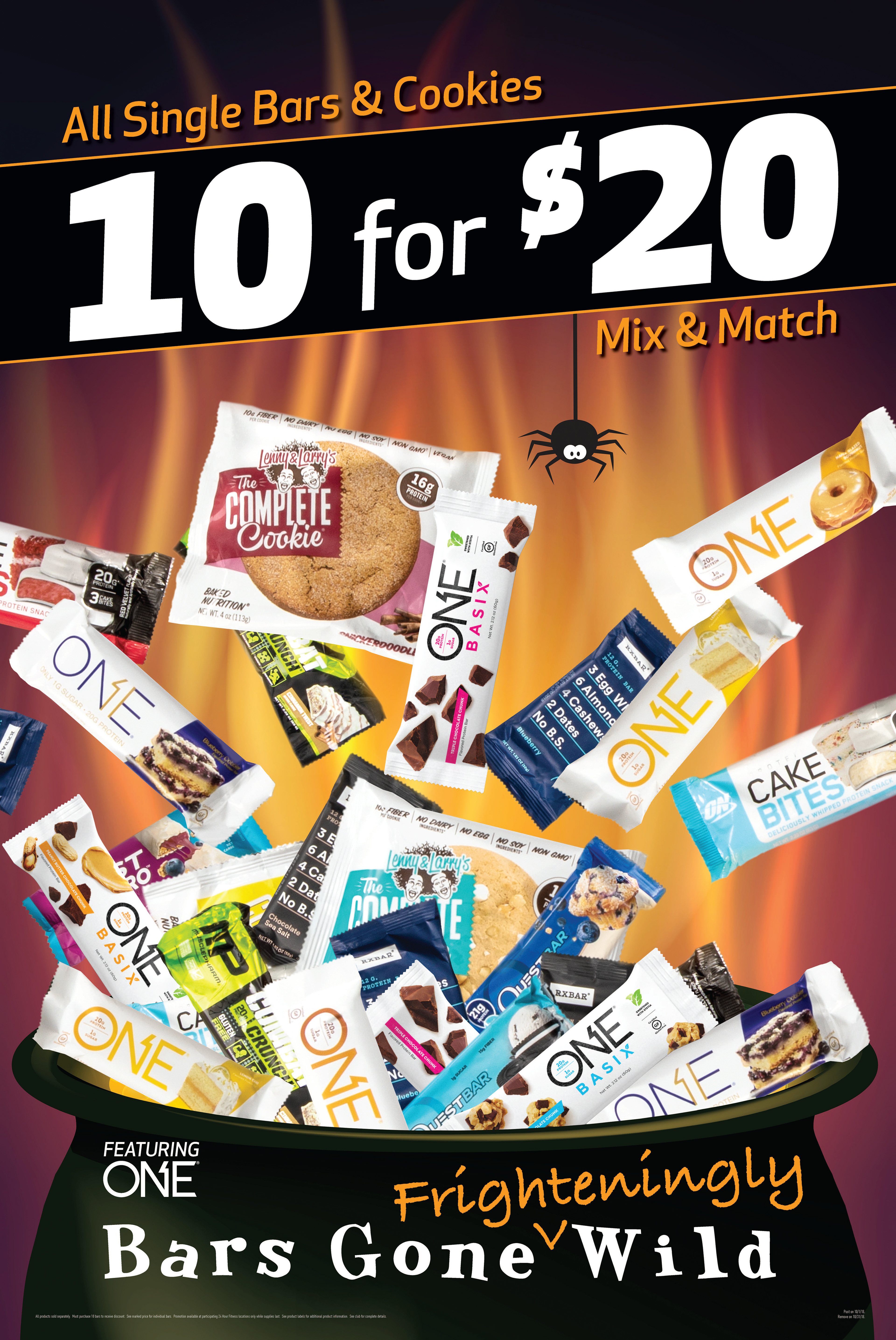
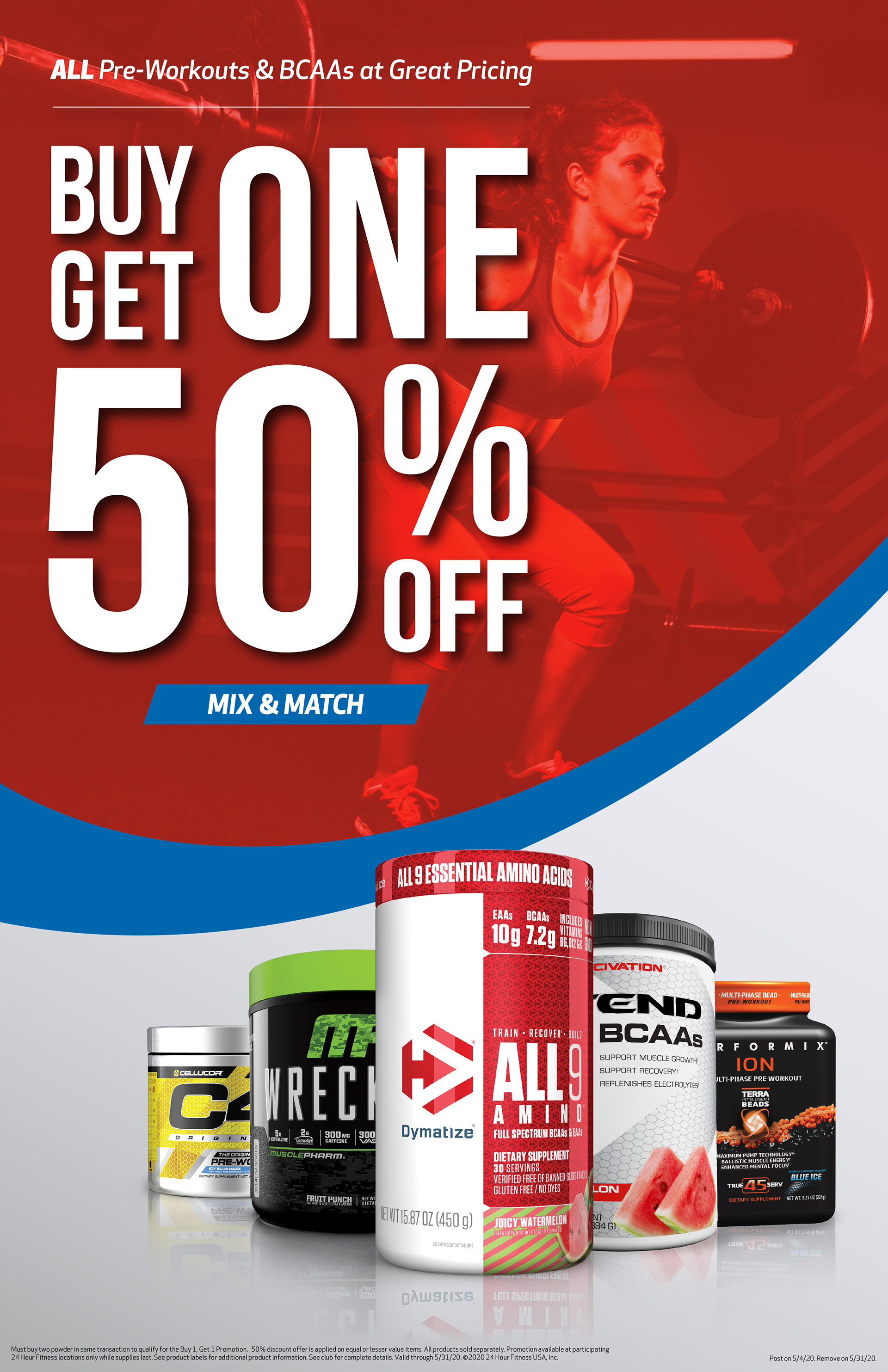
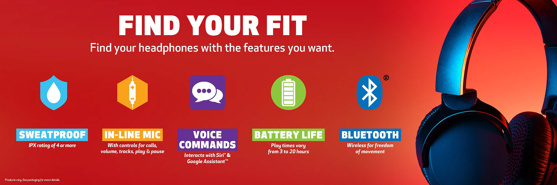
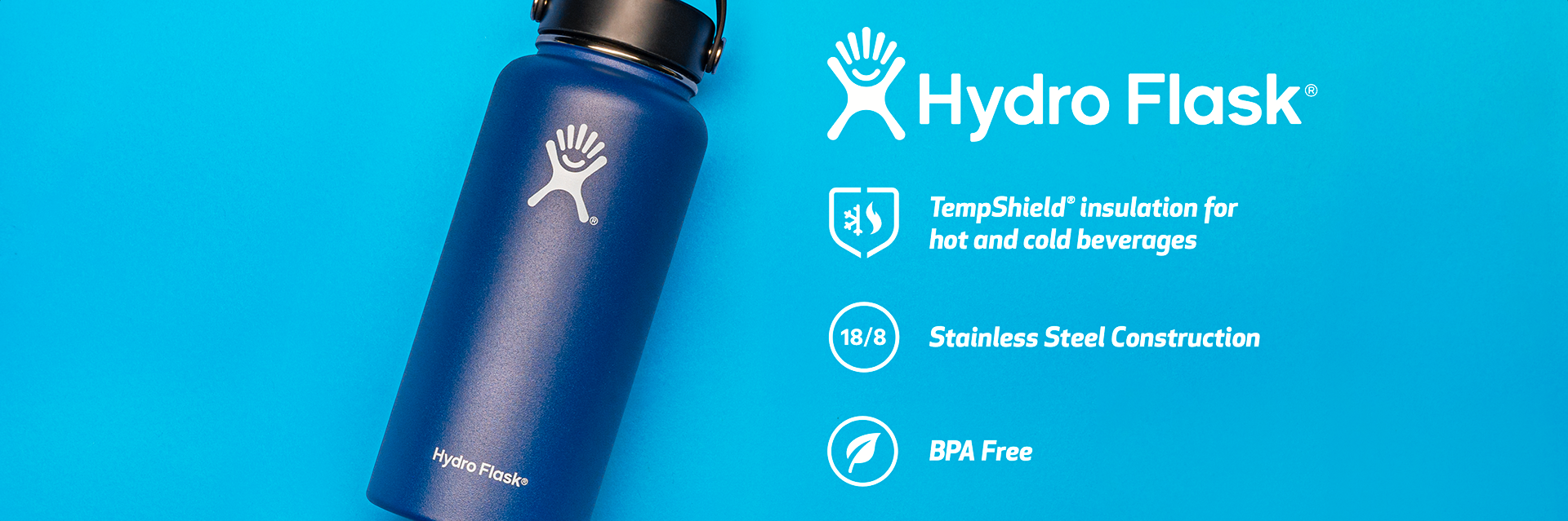
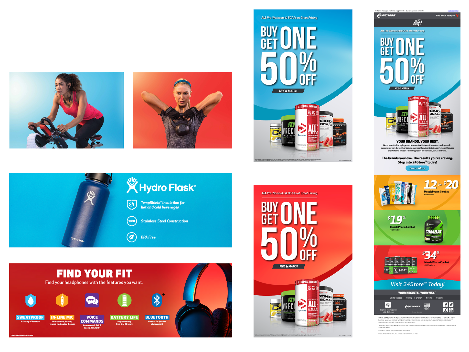
Bringing Sketches to Life
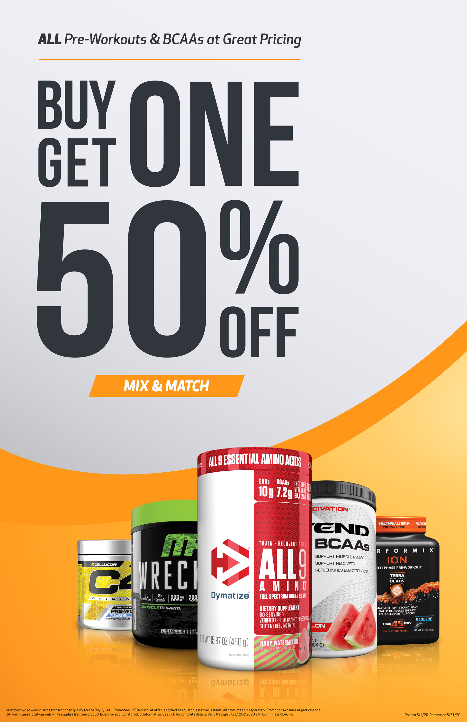
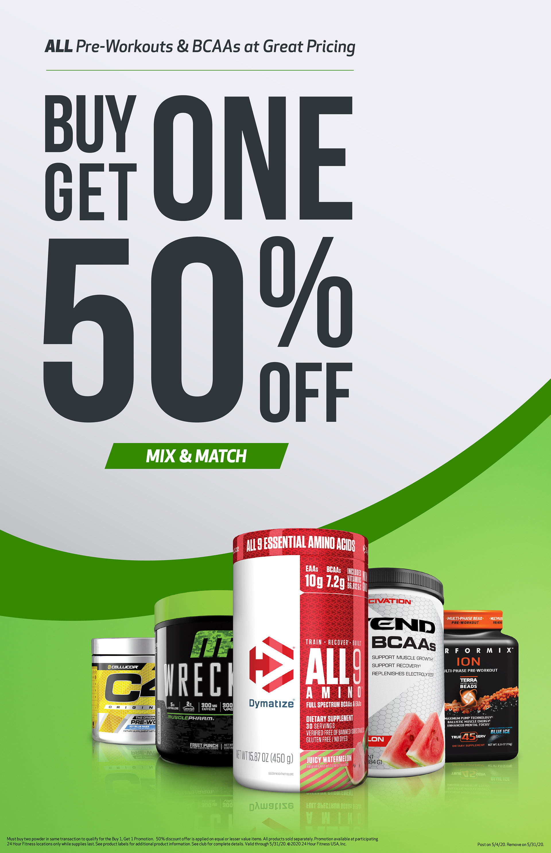
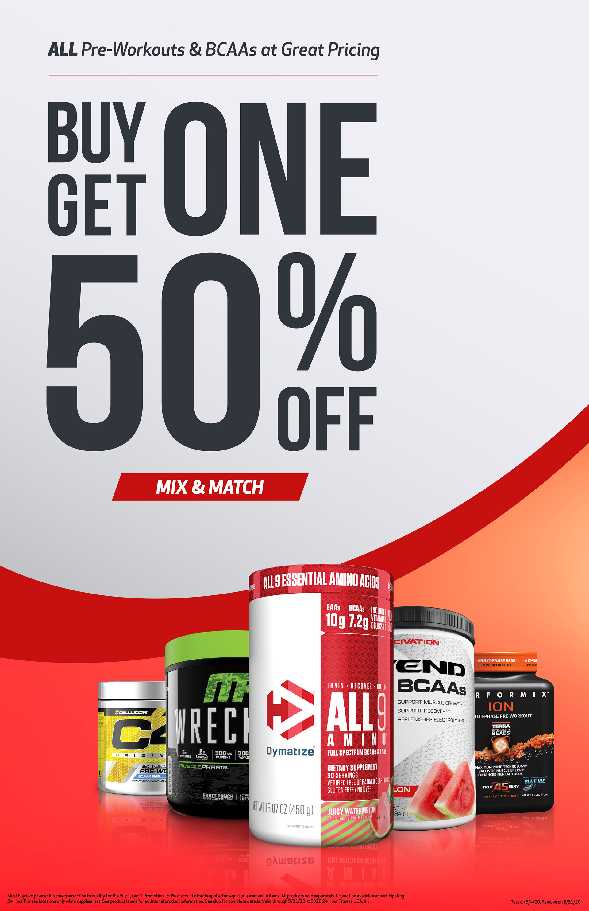
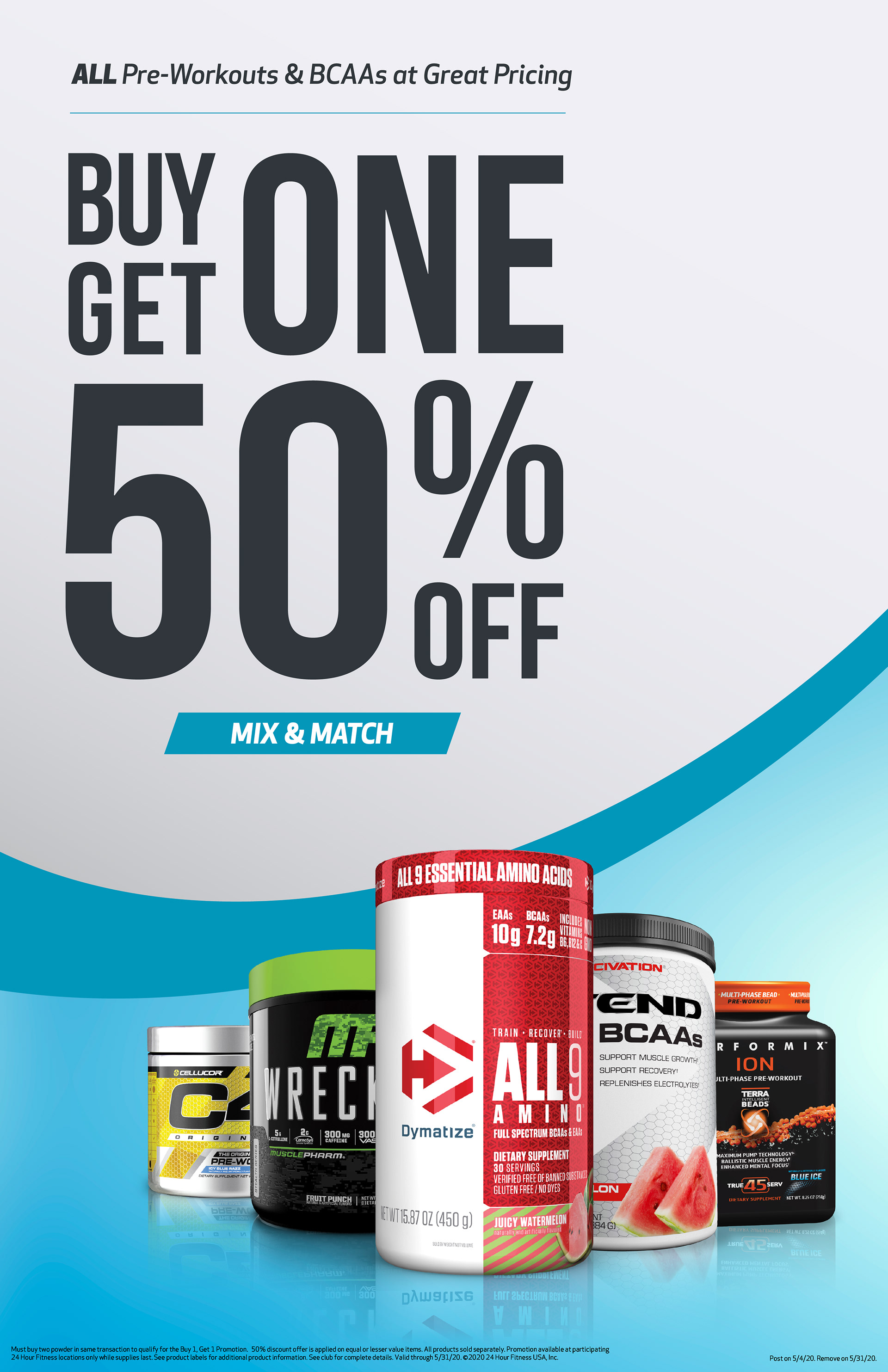
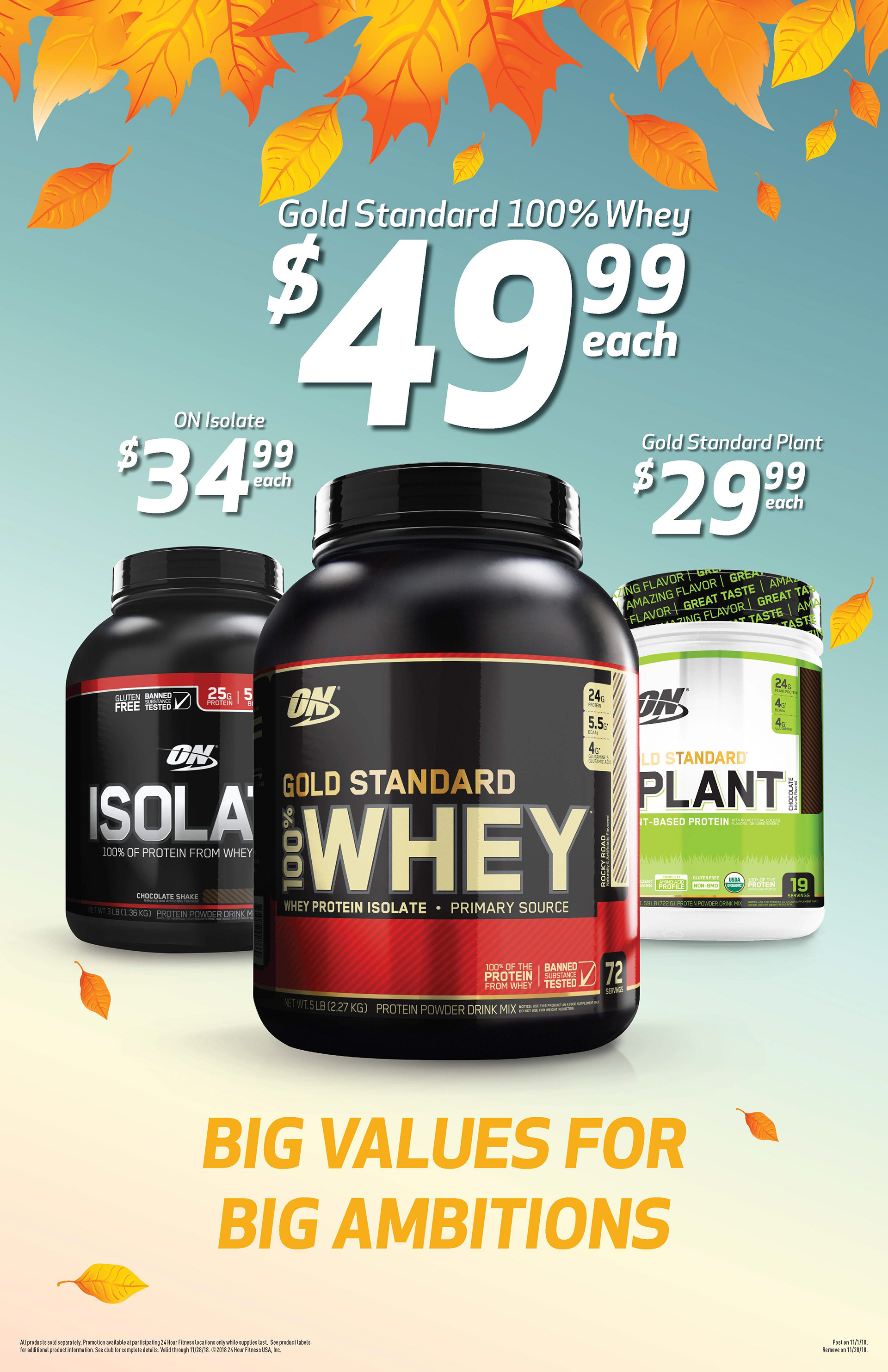
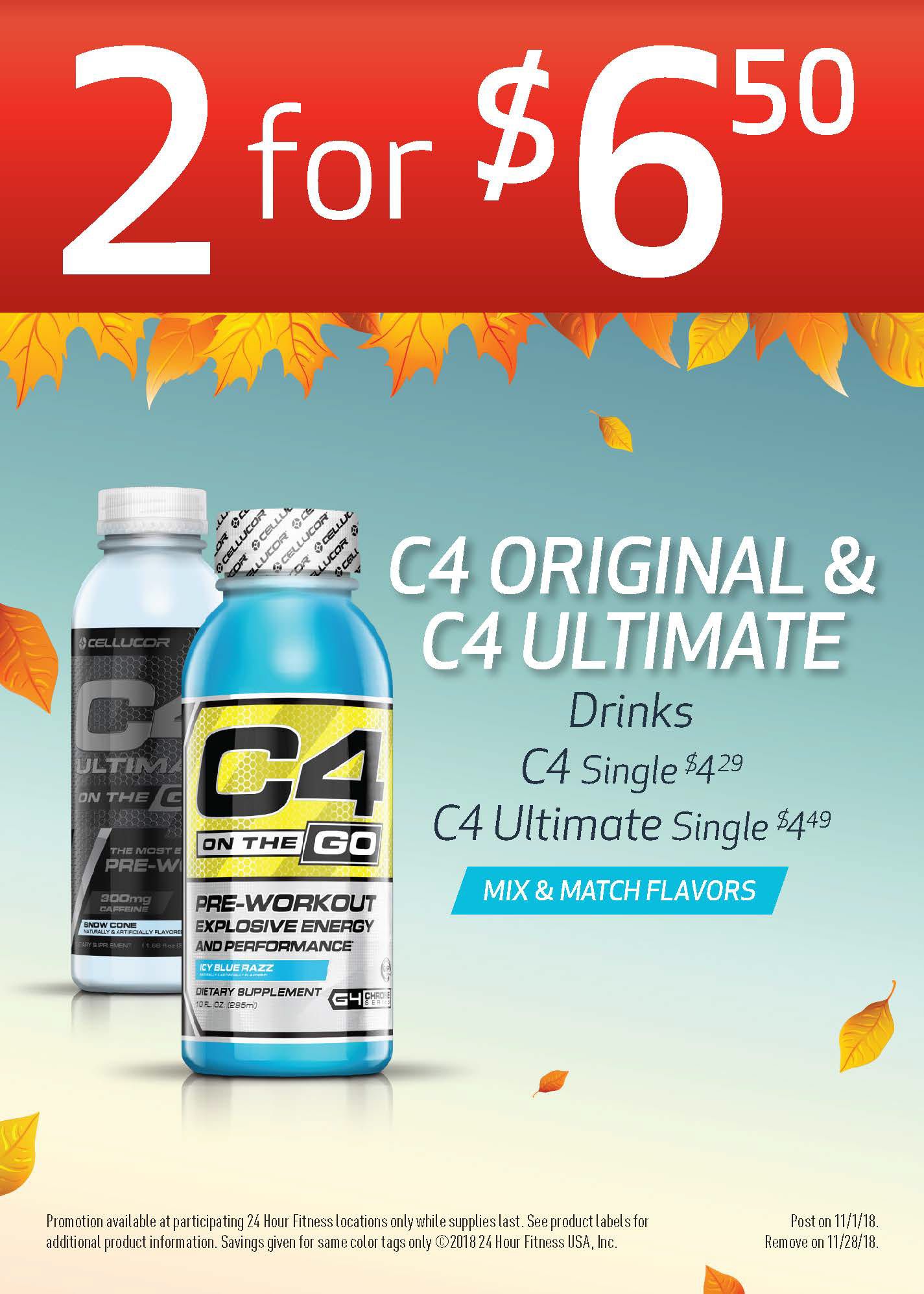
After many different ideas being brought to life, we finally decided on a unique design that would be the brand new look. It is subtle with using the 24 Hour Fitness logo as a container for the offers and has a simple clean look while connecting with the main brand and the new 24 Retail photography.
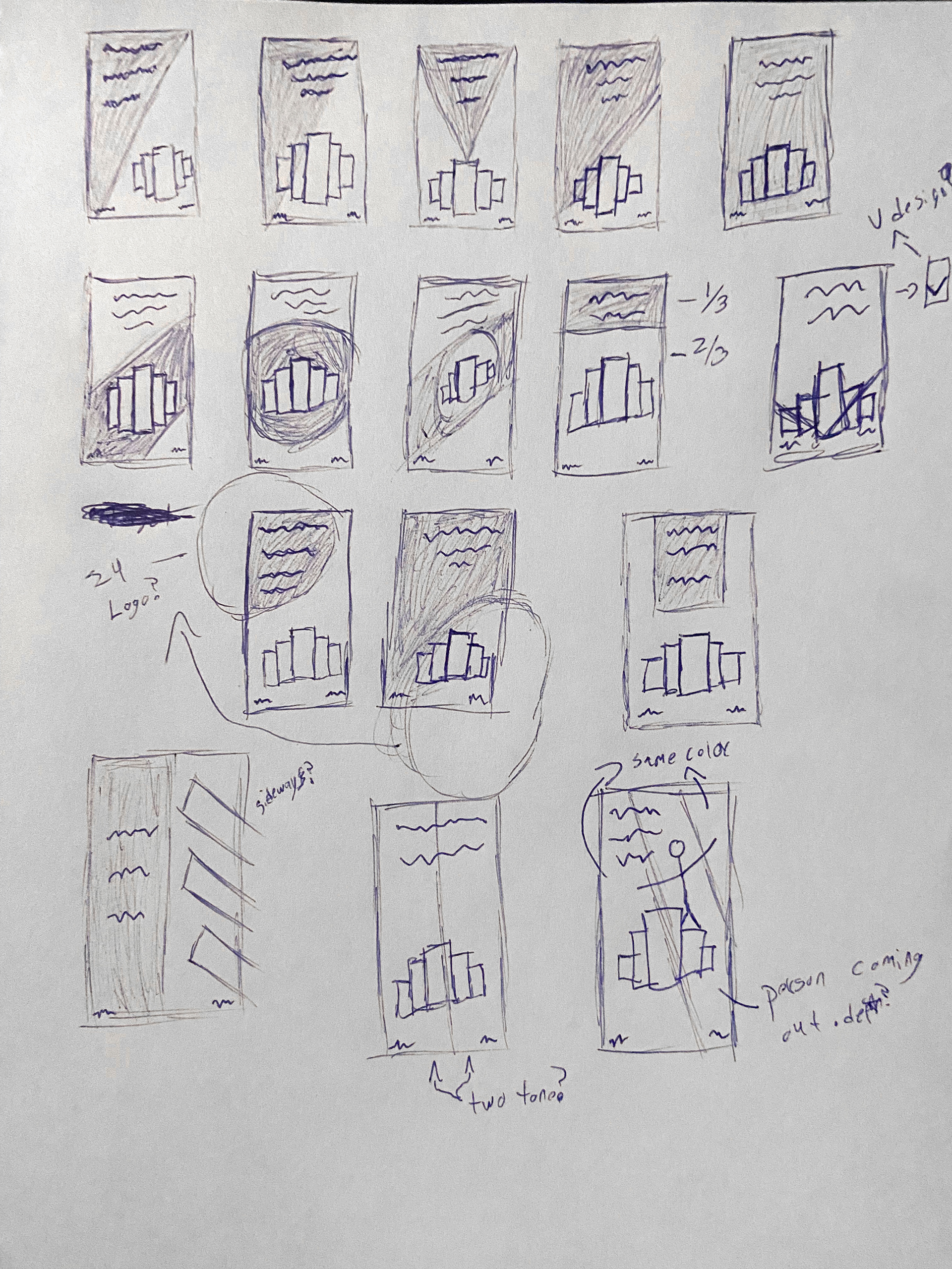
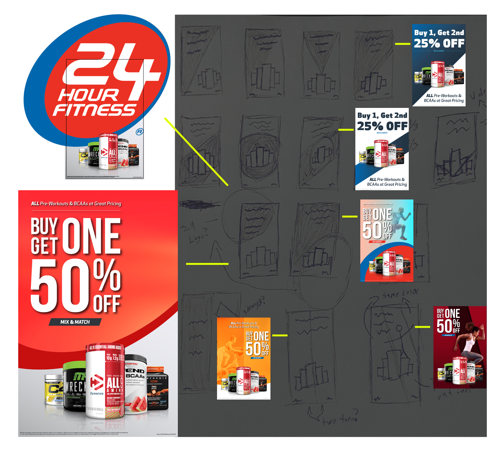
Challenges
My main challenge was to establish a cohesive design direction for the creative assets that aligned with the new brand aesthetic created through the 24 Store photoshoot images. A key difficulty was developing adaptable templates that would maintain this consistency across future campaigns, while ensuring the designs didn’t clash with the diverse range of product colors. Since we had no control over which products or offers would be featured each month, it was a challenge to create designs that could work harmoniously with any combination.
Solution
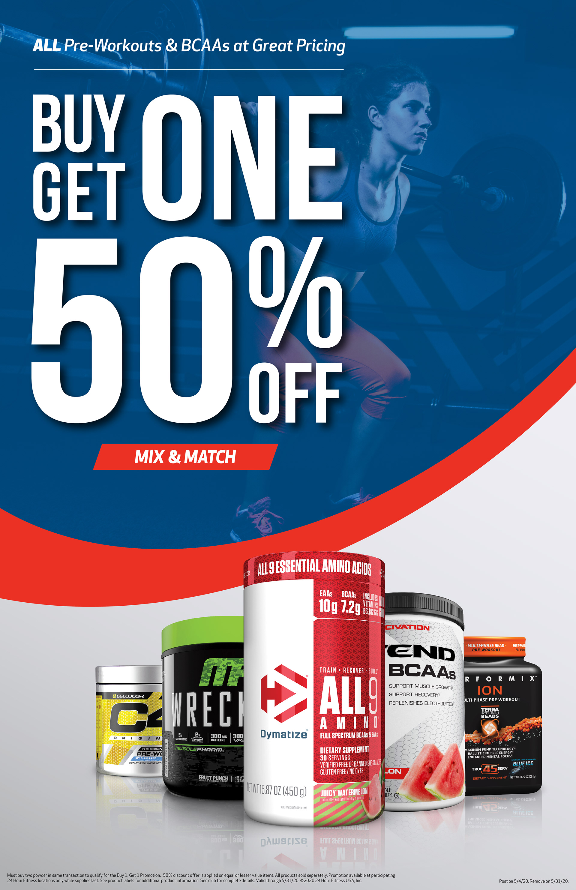
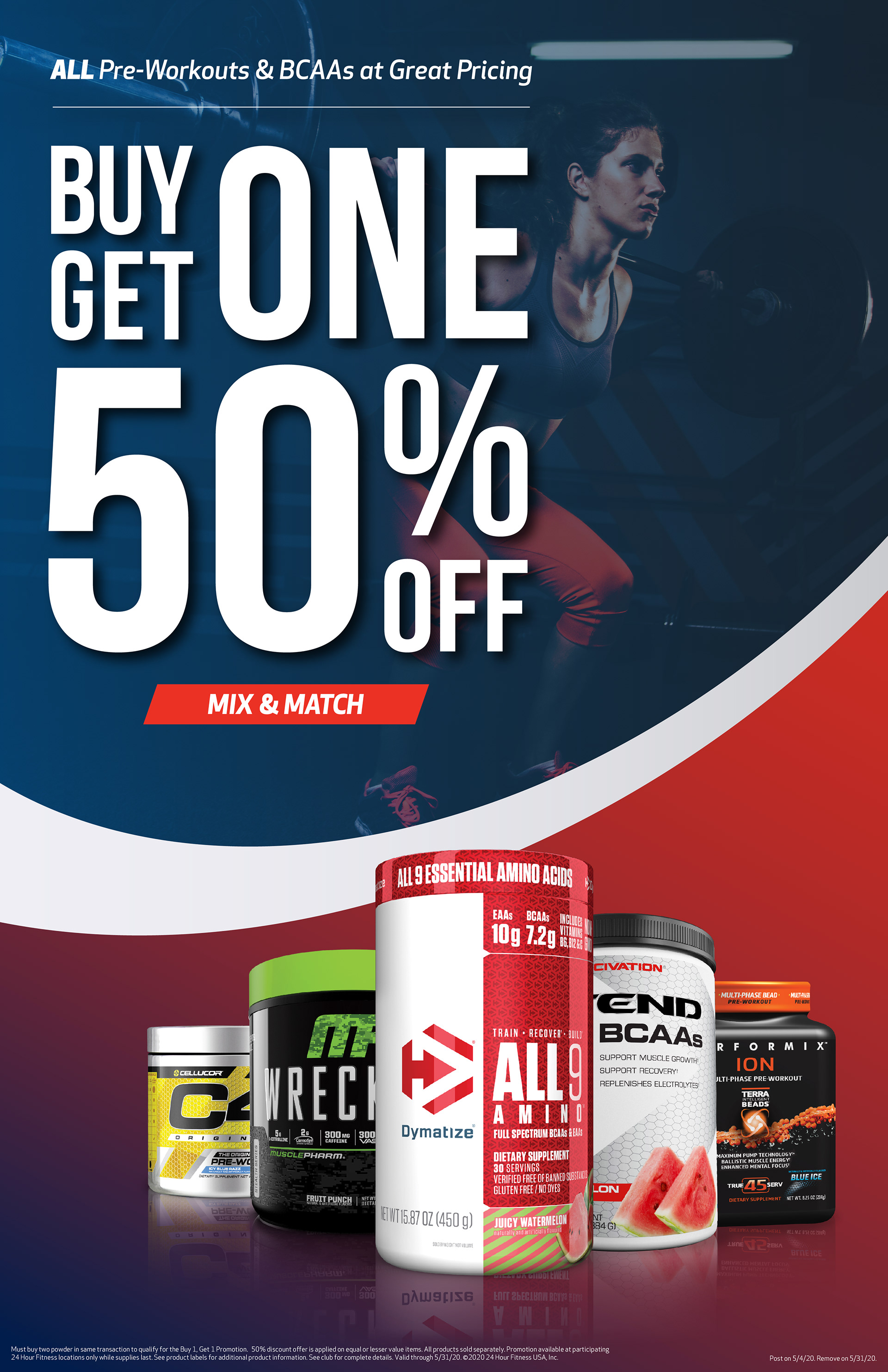
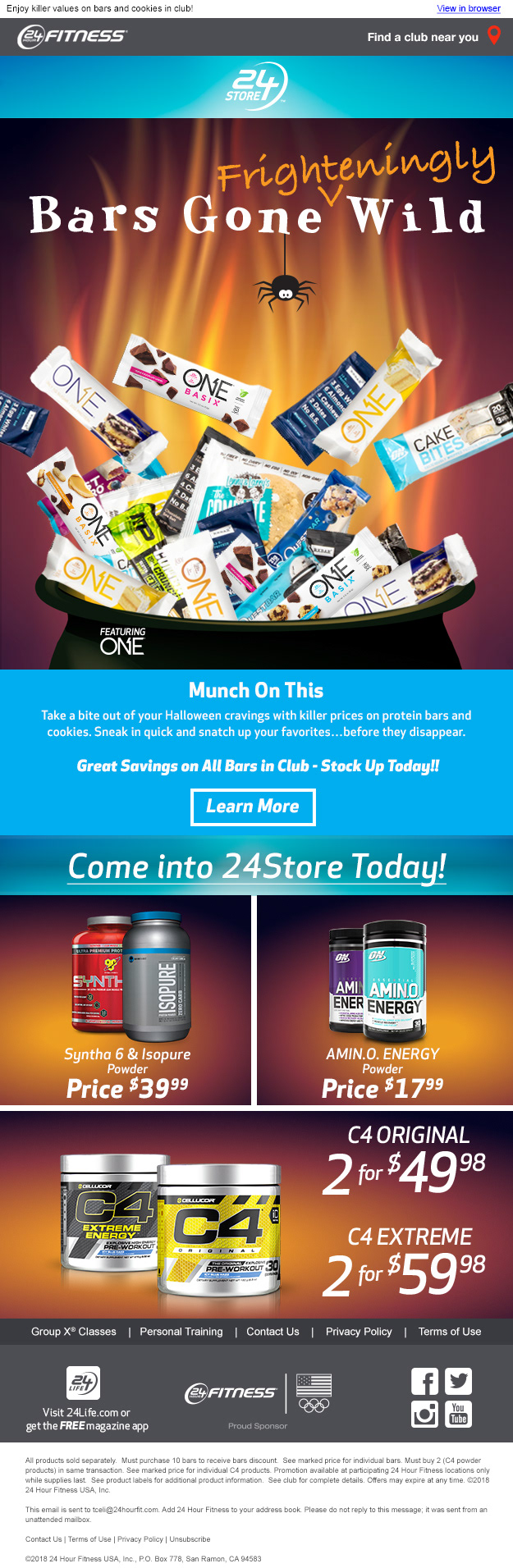
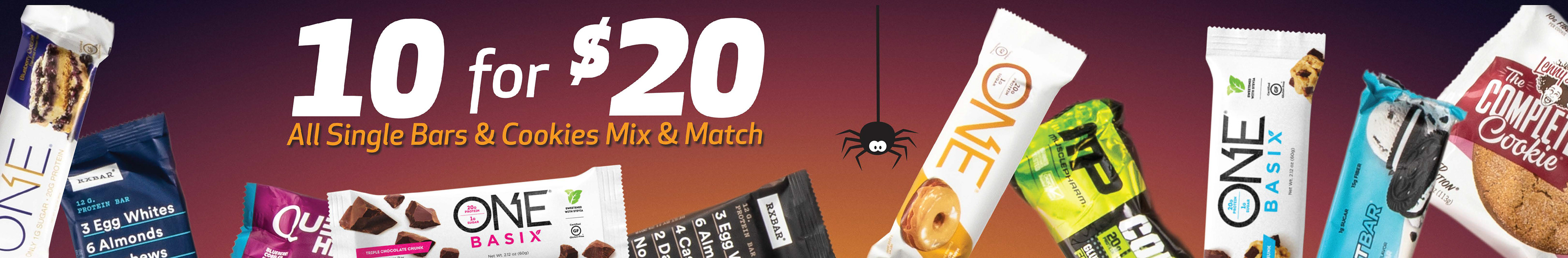
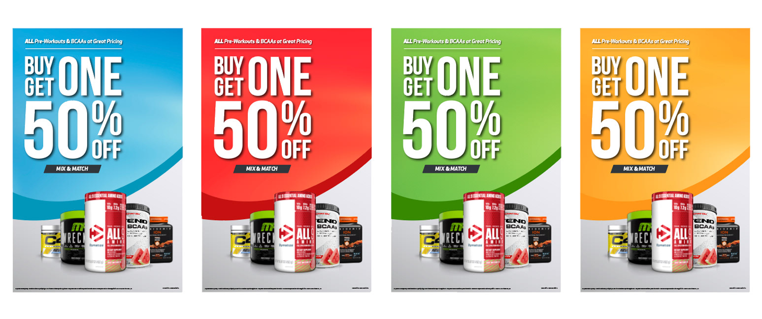
I designed monthly creative assets that closely aligned with the retail photography, ensuring a strong visual connection while making the offers stand out. To streamline the design process, we used a set of four templated colors across four months, which not only saved time during creative reviews but also minimized the number of decisions needed in internal meetings. This approach allowed me to focus more on higher priority tasks, collaborating closely with the Creative Director on the overarching brand strategy.
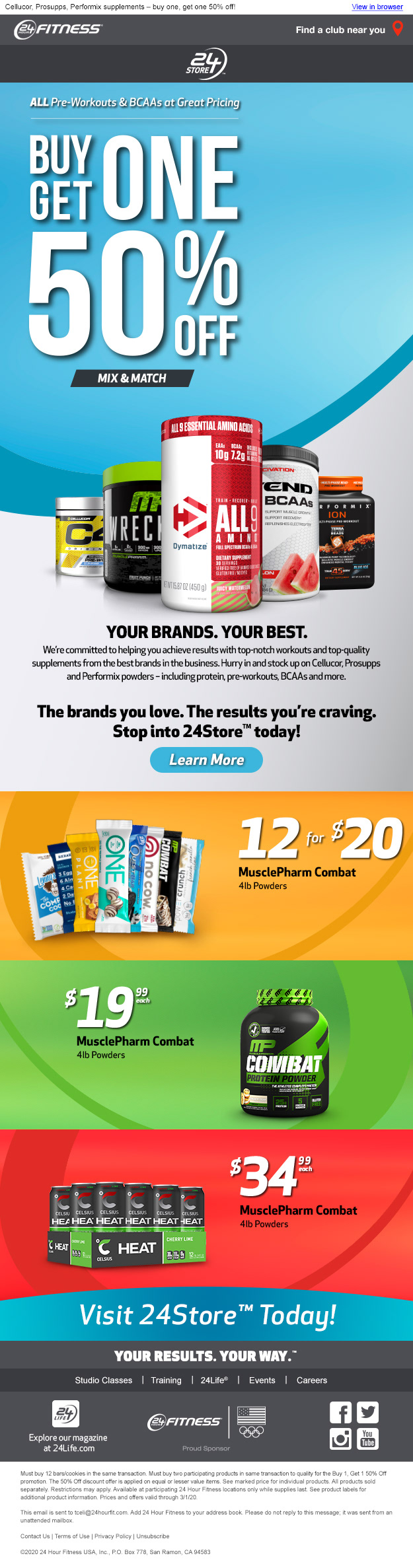
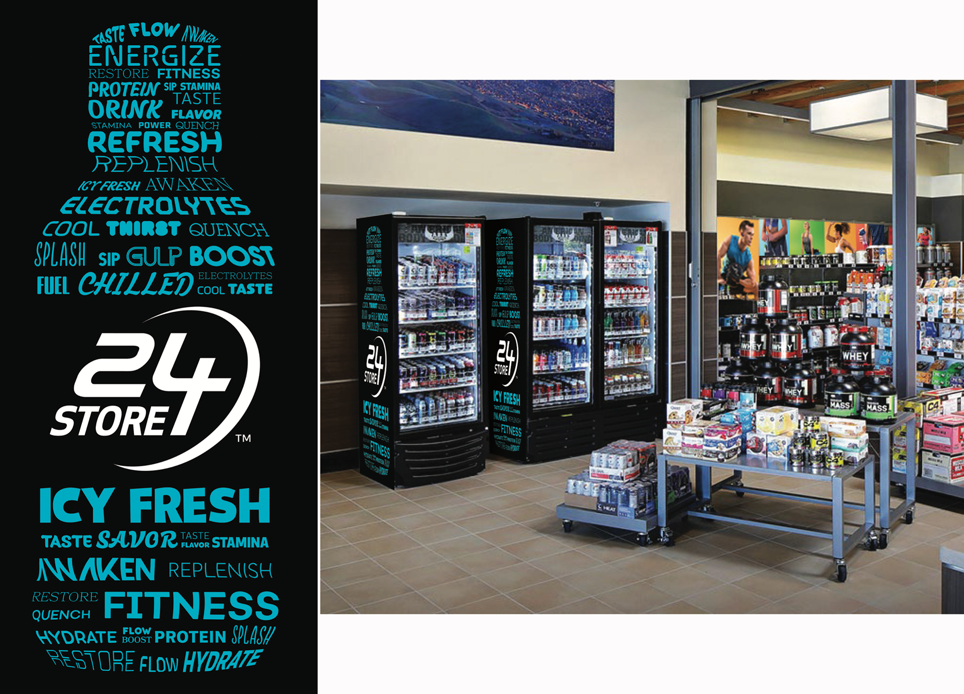
Supporting Assets
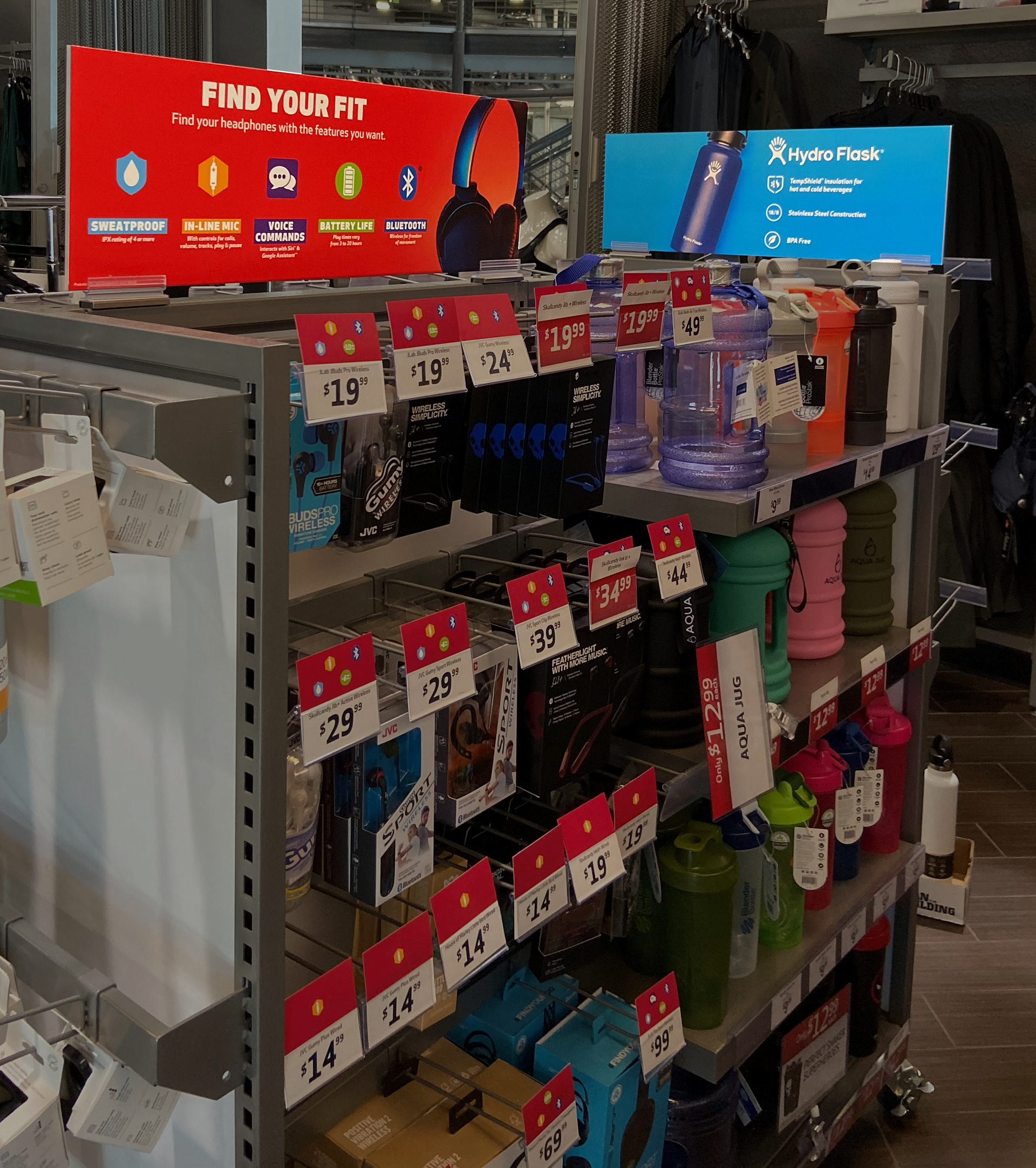
Supporting assets from vendors were also aligned with the new 24 Store aesthetic, helping to create a more cohesive and streamlined look in the retail space. This consistency in design made the vendor products stand out while contributing to a cleaner, more polished overall environment.
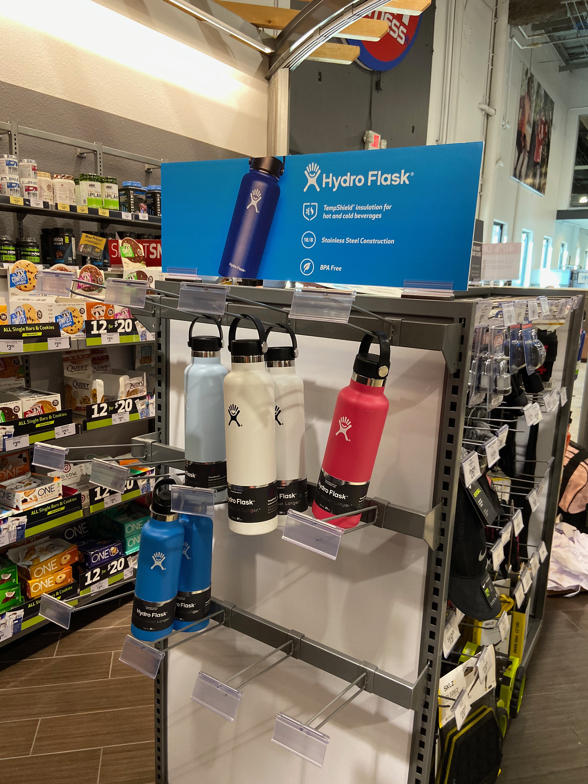
Results
The entire retail experience became seamlessly integrated, with every element, monthly creative, retail photography, price tags, and vendor signs, aligned to create a cohesive and visually engaging environment. This unity across all assets contributed to a more polished and impactful retail space.
Additional Designs
For an extra 4 months we just inverted the colors. In addition I had a few extra designs for exploring the last 4 months of the year that were well received by the internal team. Also, I added a fun typography project that I created for the gym coolers.